Overview
Currency Data APIs are widespread nowadays but there is still a dearth of reliable API that can be used easily by beginner programmers/less-technical analysts to draw charts. There are plenty of charting library’s out there but it is always a bit tricky to plug in the data that is current as most APIs are either delayed or pricey.
This tutorial is to help you create the charts with Matplotlib and Plotly using a Currency Data API. First, we will install libraries that will help us in plotting quickly.
Setting Up
pip install matplotlib
pip install pandas
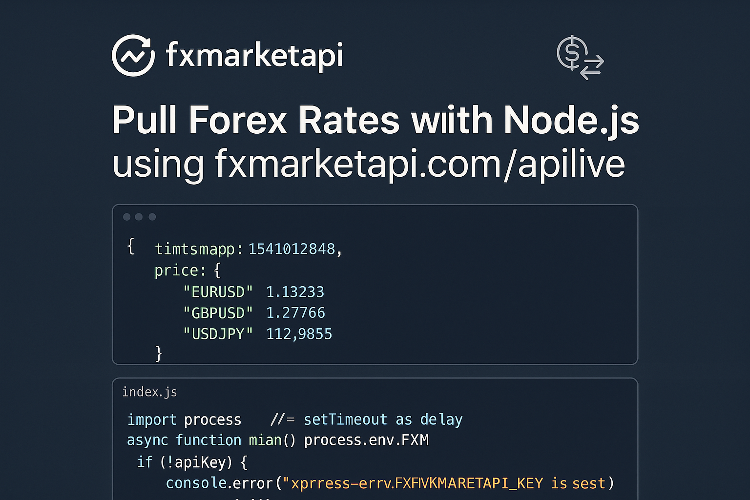
Once we have downloaded these libraries we will sign up with the data API provider which is Free. I will use https://fxmarketapi.com/
Once signed up you will receive an API key that you can use to get the data. we will now install one more library before we start importing the libraries.
pip install requests
Writing Code
Now we are ready to use the libraries either in a Jupyter notebook or python.
import matplotlib.pyplot as plt
import pandas as pd
import requests
Once the libraries are imported we will define the URL endpoint, the API key and parameters to call the data.
URL = "https://fxmarketapi.com/apipandas"
params = {
    'currency': 'EURUSD',
    'start_date': '2018-07-02',
    'end_date': '2018-12-06',
    'api_key': '**************'
}
The next step is to get the data in a pandas format so it is easy to use.
response = requests.get(URL, params=params)
df = pd.read_json(response.text)
df.head()
If you are in a Jupyter notebook you can now see the data displayed as shown above.
Plotting Charts
Now we have the data in the format we want it lets plot!
plt.plot(df['close'])
plt.show()
That is how easy it was to plot. Obviously, you are wondering about the look and feel of the chart. Well, we can improve that but you will need another library (plotly) for that.
Let’s download that library and import it (remember you will have to sign up to get the API key for Plotly as well) https://plot.ly/python/getting-started/
pip install plotly
import plotly
plotly.tools.set_credentials_file(username='DemoAccount', api_key='********')
Now that we are set up with credentials let’s make a better-looking chart.
import plotly.plotly as py
import plotly.graph_objs as go

trace = go.Scatter(
    x=df.index,
    y=df['close']
)
data = [trace]
py.iplot(data)
And it is as easy to make a candlestick chart as well.
trace = go.Candlestick(
    x=df.index,
    open=df['open'],
    high=df['high'],
    low=df['low'],
    close=df['close']
)
data = [trace]
py.iplot(data)